Introduction:
Why do we need a style guide?
Adhering to a style guides gives us to opportunity to ensure all of our Tableau workbooks are consistent, accessible, and user friendly. It contributes to increased user confidence with data and a trusted SIA brand across the University.
This guide will cover the main elements of Tableau report design with the aim to keep consistency within SIA Tableau reports. It is aimed to be used in conjunction with the template and may also be a useful reference for when the template is not wholly sufficient for a certain report or dataset.
Please see the template here: https://tableau.york.ac.uk/#/workbooks/4573/views (you will need to be connected to the VPN to access this link)
Skip to specific areas of interest using the links below:
Report Body
Homepage
Aim: To introduce the user to the subject and data. This is an opportunity to provide additional context and signpost helpful resources.
Try to keep text on this page as concise as possible - allowing space for navigation buttons
Navigation buttons should not be too condensed. If the number of tabs exceeds the number of buttons that can comfortably fit on the homepage it might be worth evaluating whether every tab is essential
Ensure key information such as population, time frame or scope of report is surfaced here
Ensure that the i button is highlighted and users are informed of how they can seek more information and support
Text and phrasing
Aim: To ensure reports are clear, concise and readable. Space within dashboards is limited and any text needs to enhance user understanding and report usability.
Titles
Report titles should be concise and descriptive
Dashboard titles should be phrased as a question to guide the user towards the answers that the dashboard is designed to supply
Acronyms
Where reports specific acronyms are used in visualisations (for example, GD for Good Degree in Degree Outcomes workbooks) these need to be defined either in sheet titles, captions or in dashboard titles.
Where standard acronyms are used, these need to be defined in the i button
Standard acronyms are ones used regularly by SIA or within the HE sector. Such as:
PY = Previous Year
HEP = Higher Education Provider
Filter text
Filter text should be clear and concise. It should fit easily within the space allowed by the blue filter bar (text wrapping is not an option)
Ideally, a user should be able to discern the filter function from the filter text
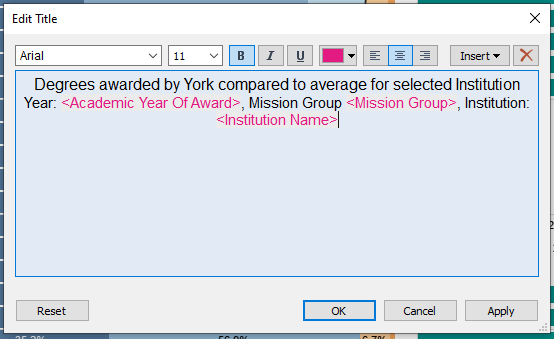
Where a filter is impacted by the settings of a different filter (i.e. ‘Only relevant values’ is activated) when filter text could benefit from being dynamic. Follow SIA’s guidance on using dynamic filter text.
Filter selections should appear in the visualisation title. This helps users to understand exactly what they’re looking at and prevents misunderstanding of data due to forgotten filter settings.
Once in the dashboard, double click the sheet to edit the title
Use the ‘Insert’ button in the text editor menu to add in the relevant filterable elements.
Use colour formatting to make these dynamic title elements as clear as possible
Consistent use of specific terminology
Use the phrase Benchmark Group as opposed to Comparison Group or Mission Group
PY should always stand for Previous Year
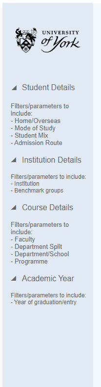
Filters
Aim: Filters should enhance a report - offering users the opportunity to drill down into certain areas of interest and generally increase the flexibility and longevity of reports.
Filters should always be placed to the left and in the blue filter bar
When the ‘academic school or department’ filter is in use, this should always be set to show school as the default.
Check whether your filters are necessary on every page? If the data fits within one visualisation without the need to scroll then filters on this dashboard may not be necessary.
Filters which can be categorised should be grouped and ordered in a logical or hierarchical manner.
A hierarchical structure may look like:
Home or Overseas
Domicile
Region
City
Where there are multiple groups they should be given a title by inserting a text box between the filters.
Add written filter instructions if needed.
See guidance for creating dynamic filter text where filters impact each other.
Employ the use of show / hide buttons for your filters if there are too many to fit on one page.
Font and text colour
To set the font and text sizes for the entire workbook navigate to Format > Workbook.
This opens a panel to the left of the screen where you can amend the setting to the following:
All = Arial, (no size), #666666
Worksheets = Arial, 9, #666666
Tooltips = Arial, 10, #333333
Worksheet titles = Arial, 15, #333333
Dashboard titles = Yu Gothic UI Semibold, 24, #333333
Story titles = Arial, 18, #333333
Colours
Aim: Colours should be used to draw the users eye to specific data and to help get the report’s message across. Use colours with consistency and consider colour blindness when presenting shades of colour in the same visualisation.
SIA recommends the use of the University brand colours
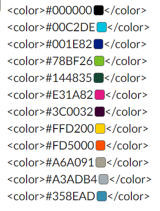
Add these colours to your Tableau repository to make them easy to incorporate into Tableau reports.
In addition to the brand colours listed above, the following colours and palettes are used in the style guide as follows:
York highlight = Pink (from brand colour palette) #E31A82
Russell Group = Teal #008e89
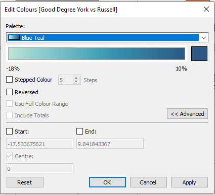
Negative = Orange from Tableau Orange Blue Diverging palette (if using continuous data)
Positive = Blue from Tableau Orange Blue Diverging palette (if using continuous data)

If you’re not using continuous data but you wish to apply positive / negative colours use the hex codes below:
Use line one for the post positive and line 13 for the least positive
<color>#26456e</color>
<color>#1c5998</color>
<color>#1c73b1</color>
<color>#3a87b7</color>
<color>#67add4</color>
<color>#7bc8e2</color>
<color>#cacaca</color>
<color>#fdab67</color>
<color>#fd8938</color>
<color>#f06511</color>
<color>#d74401</color>
<color>#a33202</color>
<color>#7b3014</color>
NOTE: Where Russell Group is being highlighted along with positive / negative formatting, using teal keeps the colour formatting really clear.
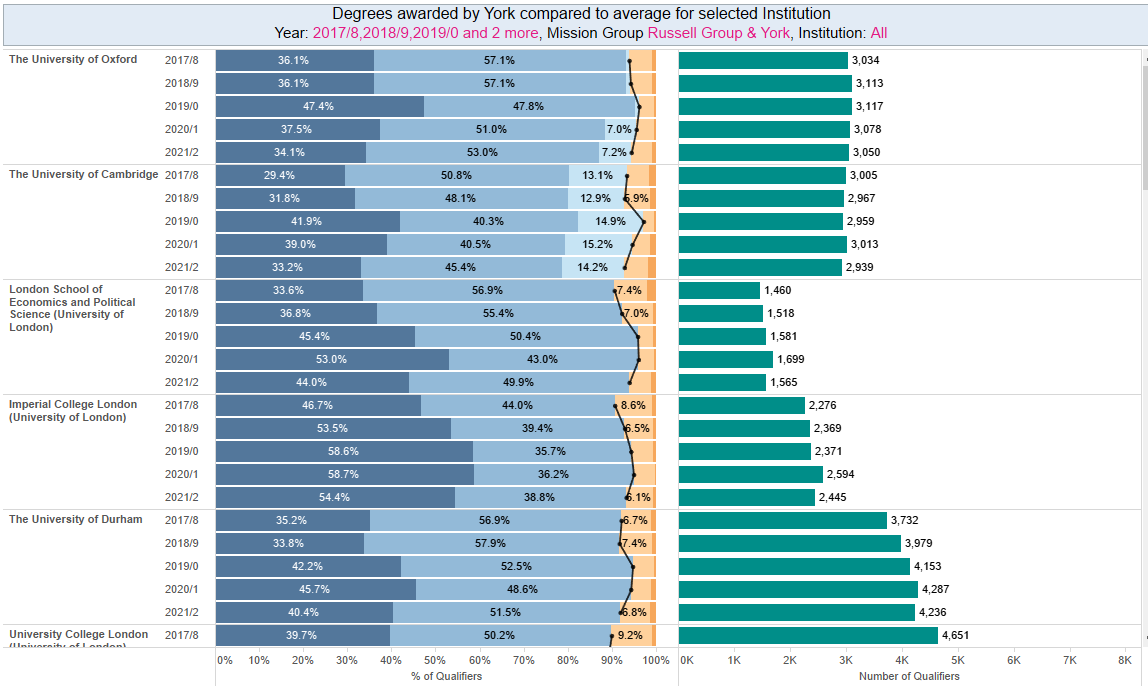
Top 3 highlight = Tableau blue-teal tableau gradient
Tooltips
Follow these basic principles to ensure tooltips are enhancing your dashboards.
Leave tooltip formatting until the rest of the dashboard is complete
Minimise information held in the tool tip to avoid extra clutter
Where necessary re-write field names to make them readable
Where possible present data in a sentence format, for example ‘The department of X has X% international students’
This can be done using the ‘insert’ function
Call out important stats via colour and size formatting (make the most of York’s branding colours)
Is there information not already in the dashboard which may help users to understand the data / context better? For example, if your dashboard contains percentages can you include the population in your tooltip?
Examples of good tooltips
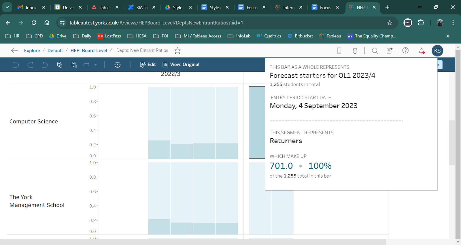
Written in plain English
Calls out important data via size formatting
Adds context to data by providing extra figures such as totals and percentages
Follow this link for more advanced guidance: https://docs.google.com/document/d/1hWuyDPreU8CYXtbUywRgN_d8pmfbUdyuc8mcLOYtH_k/edit#heading=h.uadppyqyvp3
Formatting
This section will cover elements of report creation which are consistent across all reports and do not necessarily impact the presentation of data.
Information button
Aim: To provide a resource for users to find more information, support, definitions, and explanations of data within the report.
How to configure the information button:
Follow the guidance on how to add an information button
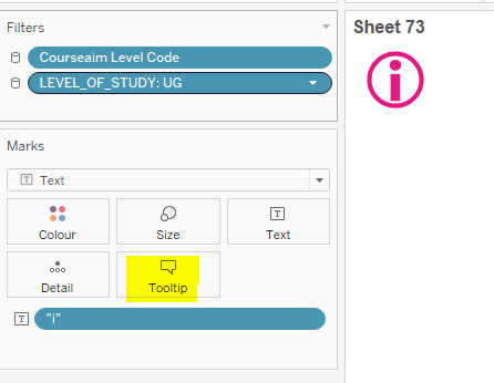
To edit the text which appears in the information button, edit the tooltip
What to include in the information button:
Where is data from?
When is data from?
When will data be updated?
Last updated date
How to reset filters
Who is the data owner?
Common acronyms to be aware of
Who to contact about the report?
Anything users need to be aware of regarding data structure
Population making up data
Footer
Added to the bottom of the report template so that users are consistently provides with SIA contact details and Tableau training materials.
Add the SIA contact details (business-intelligence@york.ac.uk)
Tableau training link - Tableau Viewer Initial Training
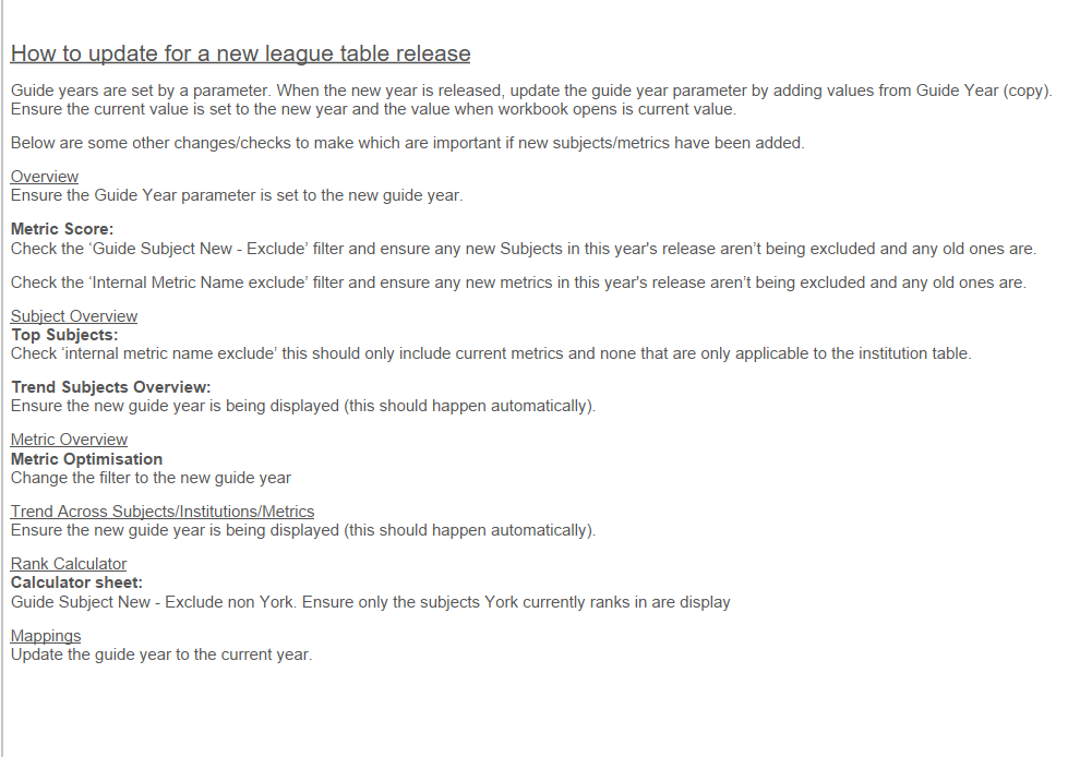
How to update
If your report will be updated year on year it may benefit colleagues to include an unpublished sheet called ‘How to update’.
See the example below from the Complete University Guide:
Display size
Users across the University have a variety of screen sizes and reports need to appear consistently for all users.
There is a preference for fixed sizes so we can guarantee a good user experience.
1400 X 800 is the most common and recommended fixed size to use.
Dashboard sizes should be consistent within a workbook. Publishing a workbook with a variety of dashboard sizes can result in lots of blank space on small dashboards as the server attempts to standardise the workbook.
Sheet Padding
When pulling sheets into a dashboard, the following padding is recommended:
Outer padding:
Top = 0
Bottom = 0
Left / Right (if on outer edge) = 16
Any edge adjacent to another sheet = 8
Inner padding:
All sides = 4
This is set using the layout tab in the left hand column which will appear when a sheet in a dashboard is selected:

Whilst this padding is advised, this is not mandatory and is dependent on your data and dashboard structure.
Report tagging
When publishing reports to Tableau Server we have the option to add tags. These help to surfact reports when a user searches for them, especially when entering more unusual search terms.
Some basic rules for adding tags are:
Add common acronyms as a tag for example the ‘National Student Survey’ workbook should have ‘NSS’ as a tag
Where the acronym is the report title ensure the full version of the name is a tag, for example a workbook called ‘UoY Decliners’ should have University of York Decliners’ as a tag
Include top level descriptions of the data / population for example:
Survey
Postgraduate
Undergraduate
Overseas
Specific visualisation guidance
Some visualisations can be tricky to configure in a way that adds value to reports, adheres to the style guide, and is intuitive for users.
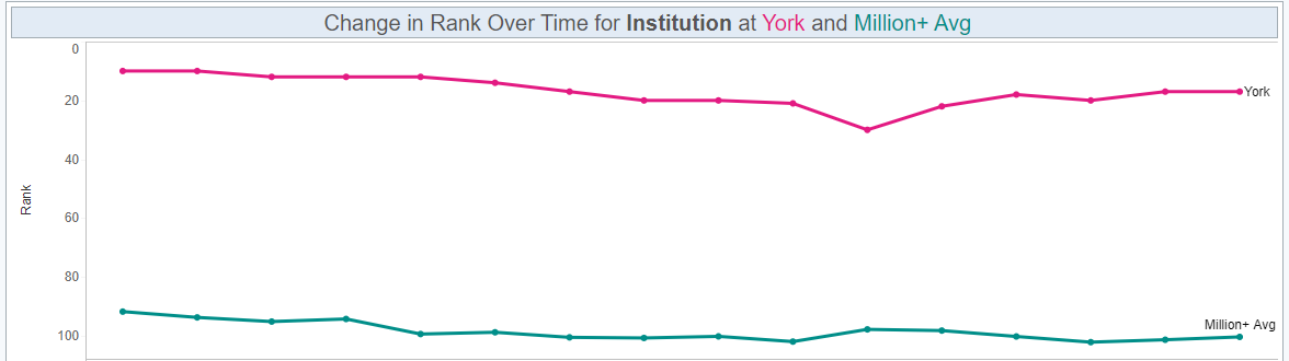
Timeline charts
Timeline charts are a really helpful way of showing data trends in a clear and familiar way. However, they can fall victim to becoming overcrowded resulting in a loss of clarity.
Maximum of 5 data points plotted.
If showing multiple data points over time it’s best to default to a maximum of 5 data points. Please note that this is a maximum, and fewer than 5 would be fine. If all your data points are very similar, for example the lines cross over a lot or block one another from view this maximum may need to be adjusted.
Remove visual clutter.
Below are some basic questions to help slim down the volume of data presented in a timeline chart
Is it necessary to have data labels on all data points?
Are the axis titles essential?
Do you need a trendline?
Use colour formatting to focus attention
If you have to have multiple lines showing as default then consider highlighting the line of interest by setting the other lines to grey or making them more transparent
The priority line can also be set to the highlight colour and made thicker
Unless necessary don’t show data over more than a 5 year period
Additional years can be pulled in via a filter by the user if necessary
Ensure the trend of the line can be easily determined.
It can be space efficient to condense multiple line charts onto a single dashboard, however, if this flattens the line to the point that the trend is not immediately obvious then consider a different approach.
An example of where line charts are well formatted is the Complete University Guide Tableau workbook.