Introduction:
...
| Panel | ||||||||
|---|---|---|---|---|---|---|---|---|
| ||||||||
Report BodyHomepageAim: To introduce the user to the subject and data. This is an opportunity to provide additional context and signpost helpful resources.
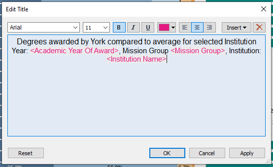
Text and phrasingAim: To ensure reports are clear, concise and readable. Space within dashboards is limited and any text needs to enhance user understanding and report usability. Titles
Acronyms
Filter text
 Consistent use of specific terminology
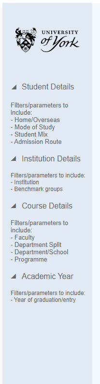
FiltersAim: Filters should enhance a report - offering users the opportunity to drill down into certain areas of interest and generally increase the flexibility and longevity of reports.
Font and text colourTo set the font and text sizes for the entire workbook navigate to Format > Workbook. This opens a panel to the left of the screen where you can amend the setting to the following:
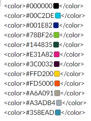
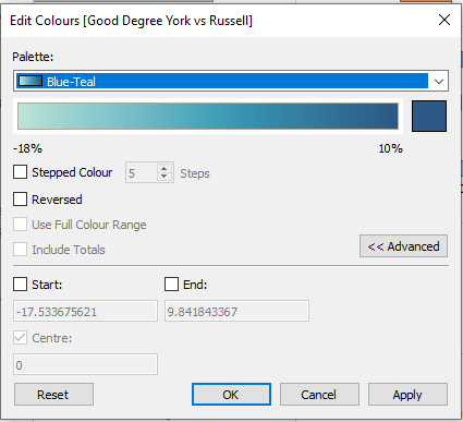
ColoursAim: Colours should be used to draw the users eye to specific data and to help get the report’s message across. Use colours with consistency and consider colour blindness when presenting shades of colour in the same visualisation.

 TooltipsFollow these basic principles to ensure tooltips are enhancing your dashboards.
Examples of good tooltips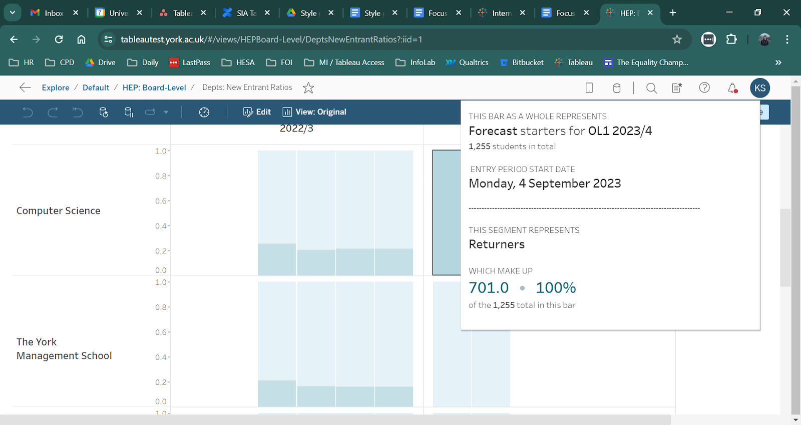
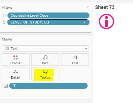
Follow this link for more advanced guidance: https://docs.google.com/document/d/1hWuyDPreU8CYXtbUywRgN_d8pmfbUdyuc8mcLOYtH_k/edit#heading=h.uadppyqyvp3 Command Buttons:Ensure these are turned off to prevent data breaches. Command buttons allow users to ‘See data’ which may have been represented as a percentage in the visualisation. This can be edited by clicking into ‘Tootips’ in the Marks card and un-ticking ‘Include command buttons’
|

| Panel | ||||||||
|---|---|---|---|---|---|---|---|---|
| ||||||||
FormattingThis section will cover elements of report creation which are consistent across all reports and do not necessarily impact the presentation of data. Information buttonAim: To provide a resource for users to find more information, support, definitions, and explanations of data within the report. How to configure the information button:
 What to include in the information button:
FooterAdded to the bottom of the report template so that users are consistently provides with SIA contact details and Tableau training materials.
How to updateIf your report will be updated year on year it may benefit colleagues to include an unpublished sheet called ‘How to update’. See the example below from the Complete University Guide: 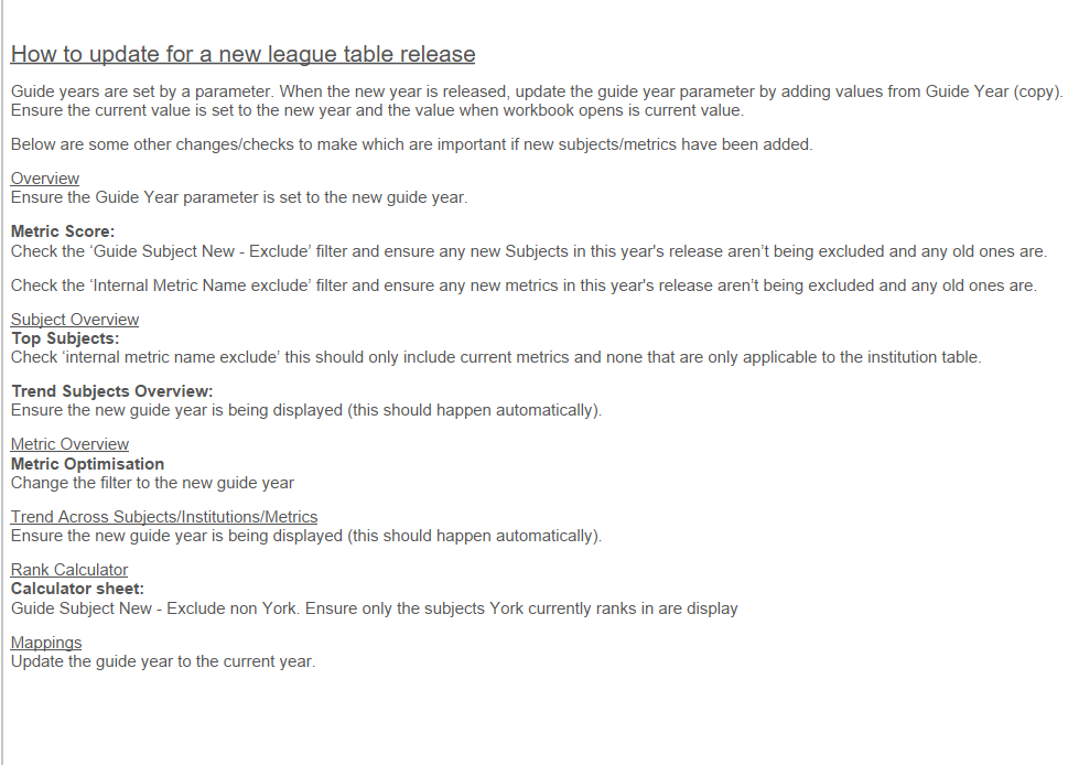 Display sizeUsers across the University have a variety of screen sizes and reports need to appear consistently for all users.
Sheet PaddingWhen pulling sheets into a dashboard, the following padding is recommended: Outer padding:
Inner padding:
This is set using the layout tab in the left hand column which will appear when a sheet in a dashboard is selected:
Whilst this padding is advised, this is not mandatory and is dependent on your data and dashboard structure. Report taggingWhen publishing reports to Tableau Server we have the option to add tags. These help to surfact reports when a user searches for them, especially when entering more unusual search terms. Some basic rules for adding tags are:
|

| Panel | ||||||||
|---|---|---|---|---|---|---|---|---|
| ||||||||
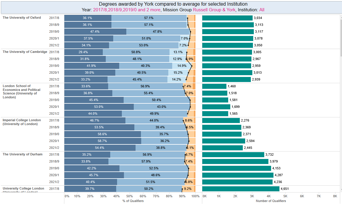
Specific visualisation guidanceSome visualisations can be tricky to configure in a way that adds value to reports, adheres to the style guide, and is intuitive for users. Timeline chartsTimeline charts are a really helpful way of showing data trends in a clear and familiar way. However, they can fall victim to becoming overcrowded resulting in a loss of clarity.
An example of where line charts are well formatted is the Complete University Guide Tableau workbook. 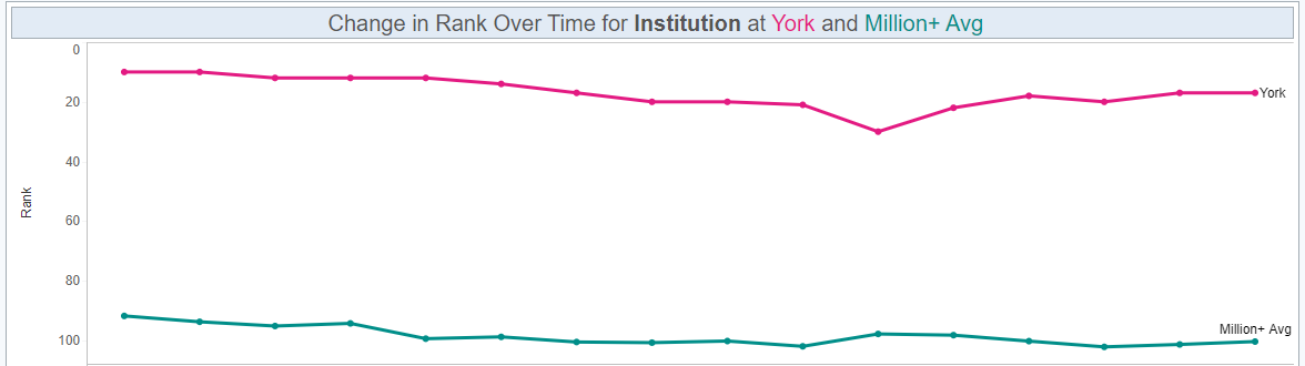 |
...