Report BodyHomepageAim: To introduce the user to the subject and data. This is an opportunity to provide additional context and signpost helpful resources. Try to keep text on this page as concise as possible - allowing space for navigation buttons Navigation buttons should not be too condensed. If the number of tabs exceeds the number of buttons that can comfortably fit on the homepage it might be worth evaluating whether every tab is essential Ensure key information such as population, time frame or scope of report is surfaced here Ensure that the i button is highlighted and users are informed of how they can seek more information and support
Text and phrasingAim: To ensure reports are clear, concise and readable. Space within dashboards is limited and any text needs to enhance user understanding and report usability. TitlesAcronyms Where reports specific acronyms are used in visualisations (for example, GD for Good Degree in Degree Outcomes workbooks) these need to be defined either in sheet titles, captions or in dashboard titles. Where standard acronyms are used, these need to be defined in the i button
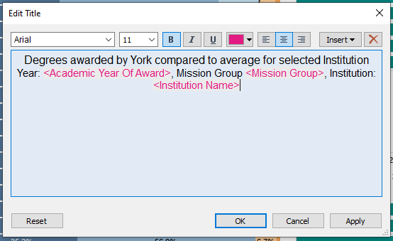
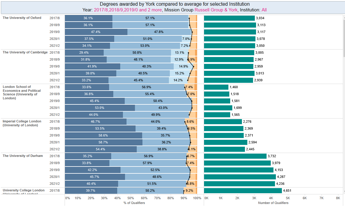
Filter textFilter text should be clear and concise. It should fit easily within the space allowed by the blue filter bar (text wrapping is not an option) Ideally, a user should be able to discern the filter function from the filter text Where a filter is impacted by the settings of a different filter (i.e. ‘Only relevant values’ is activated) when filter text could benefit from being dynamic. Follow SIA’s guidance on using dynamic filter text. Filter selections should appear in the visualisation title. This helps users to understand exactly what they’re looking at and prevents misunderstanding of data due to forgotten filter settings. Once in the dashboard, double click the sheet to edit the title Use the ‘Insert’ button in the text editor menu to add in the relevant filterable elements. Use colour formatting to make these dynamic title elements as clear as possible
 Consistent use of specific terminology
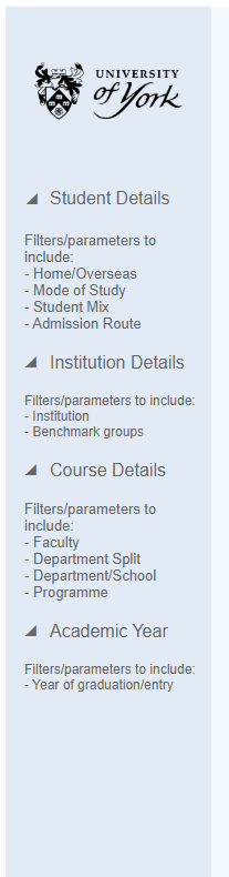
FiltersAim: Filters should enhance a report - offering users the opportunity to drill down into certain areas of interest and generally increase the flexibility and longevity of reports. Filters should always be placed to the left and in the blue filter bar When the ‘academic school or department’ filter is in use, this should always be set to show school as the default. Check whether your filters are necessary on every page? If the data fits within one visualisation without the need to scroll then filters on this dashboard may not be necessary. Filters which can be categorised should be grouped and ordered in a logical or hierarchical manner. Where there are multiple groups they should be given a title by inserting a text box between the filters.
Font and text colourTo set the font and text sizes for the entire workbook navigate to Format > Workbook. This opens a panel to the left of the screen where you can amend the setting to the following: All = Arial, (no size), #666666 Worksheets = Arial, 9, #666666 Tooltips = Arial, 10, #333333 Worksheet titles = Arial, 15, #333333 Dashboard titles = Yu Gothic UI Semibold, 24, #333333 Story titles = Arial, 18, #333333
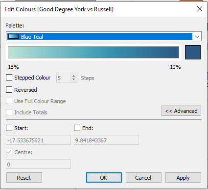
ColoursAim: Colours should be used to draw the users eye to specific data and to help get the report’s message across. Use colours with consistency and consider colour blindness when presenting shades of colour in the same visualisation. 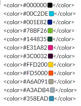 Add these colours to your Tableau repository to make them easy to incorporate into Tableau reports. In addition to the brand colours listed above, the following colours and palettes are used in the style guide as follows: York highlight = Pink (from brand colour palette) #E31A82 Russell Group = Teal #008e89 Negative = Orange from Tableau Orange Blue Diverging palette (if using continuous data) Positive = Blue from Tableau Orange Blue Diverging palette (if using continuous data)
 | Code Block |
|---|
<color>#26456e</color>
<color>#1c5998</color>
<color>#1c73b1</color>
<color>#3a87b7</color>
<color>#67add4</color>
<color>#7bc8e2</color>
<color>#cacaca</color>
<color>#fdab67</color>
<color>#fd8938</color>
<color>#f06511</color>
<color>#d74401</color>
<color>#a33202</color>
<color>#7b3014</color> |
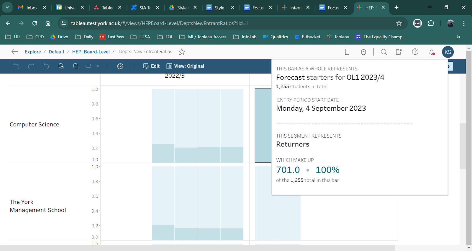
Follow these basic principles to ensure tooltips are enhancing your dashboards. Leave tooltip formatting until the rest of the dashboard is complete Minimise information held in the tool tip to avoid extra clutter Where necessary re-write field names to make them readable Where possible present data in a sentence format, for example ‘The department of X has X% international students’ Call out important stats via colour and size formatting (make the most of York’s branding colours) Is there information not already in the dashboard which may help users to understand the data / context better? For example, if your dashboard contains percentages can you include the population in your tooltip?
 Follow this link for more advanced guidance: https://docs.google.com/document/d/1hWuyDPreU8CYXtbUywRgN_d8pmfbUdyuc8mcLOYtH_k/edit#heading=h.uadppyqyvp3 |